This is my lastest project. It just so happens to be for my brother. He has a very successful masonry/construction business and employs my other 3 brothers. They do excellent work! I am in the process of designing a new logo for the business and will soon design a website as well.
I began with a few basic logos to give him some ideas.
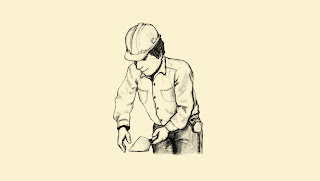
He really wanted to have an illustrated construction worker laying brick included in the design. So, I drew one up...
I then digitally colored it and added it to some of the logos.
He's having a difficult time deciding:)


Ooo...that's a tough one. They all look great! I think the ones without the worker look more professional, but the ones with give a sense of personableness.
ReplyDeleteIf there's an open poll, my vote's for the second one in the first batch and the last one in the last batch :)
Hey, that's an idea! Maybe you could open a poll here on your website and send a mass email for people to come and vote. It would be like marketing research :)
Laura,
ReplyDeleteGreat idea! Thank you so much for your input. I think your suggestion could really help Kevin and Lindsey choose! I do agree with you. The designs without the drawing are more professional, but Kevin has been pretty set on it.
I'm going to forward on your suggestion to Kev & Linds to see if they would appreciate the extra help:)
Thanks!
Thanks for this, Nik. I sent an email to a few people for them to weigh in, too.
ReplyDeleteWow Nik,
ReplyDeleteThese are great! Since he really wants a construction worker in the logo then I like the layout of the second one in the second batch, but I prefer the font in the third of the second batch. Does that make sense? I like the symmetry in the second one because its a really cool illustration and illusion of him building a wall. It has a good "chiseled" look. I just don't think the serif font can compete with the bold colors and geometric brickwork. I LOVE the big and bold font you used in the third one!! What would the overall logo look like if you replaced the serif font with the big black letters--it might look cool since your "e" is in brick. His name would become part of the wall!!! Might be cool. What do you think? I definitely like the worker though...its unique!
Katie, Thanks for your ideas! I think you are definitely on to something! I love it. I'm going to try that one out and I agree, I think it will work really well.
ReplyDeleteI voted, Jeff asked me too.. They were all good, he does a Great Job!
ReplyDeleteNikki,
ReplyDeleteThese are wonderful! You have a great gift. Never stop using it. Kevin and Lindsey's Aunt Deby
Hi Nikki -
ReplyDeleteI agree with Katie. My favorite is the second one in the second group, but with the font of the third one in the second group. You do good work!
Love,
Aunt Joanie